Copyright © 2020 Ashok P. Nadkarni. All rights reserved.
1. Introduction
The tarray_ui package implements some Tk widgets that useful when
working with tarray tables.
-
The tarray::ui::tableview widget displays data from a
tarraytable. It is written with a view to conserve memory when displaying tables with a large amount of data. -
The tarray::ui::rbcchart widget plots table data as types of graphs using the RBC Tk extension.
-
The tarray::ui::csvreader widget reads CSV data from a file into a table.
2. Installation and loading
Binary packages for some platforms are available from the Sourceforge download area. See the build instructions for other platforms.
To install the extension, extract the files from the distribution to any
directory that is included in your Tcl installation’s auto_path variable.
Once installed, the extension can be loaded with the standard Tcl package require command.
package require tarray_ui
namespace import tarray::table
In addition to Tk and tarray itself,
this package has dependencies on the following additional packages:
-
snitavailable as part of tcllib.
Individual widgets may have additional dependencies which are loaded on demand. These are noted in the documentation for the specific widget.
3. Widgets
3.1. Widget overview
3.1.1. The tableview widget
The tableview widget displays data from a tarray
table.
Based on Tim Baker’s treectrl widget,
it maintains treectrl features like drag and drop for resizing
and repositioning table columns and also adds additional features
like filtered views, visual keying of cells, tooltips
and automatic scrollbars.
3.1.2. The rbcchart widget
The rbcchart widget wraps the RBC Tk extension which implements a graphing widget capable of plotting several different types of graphs. The chart widget simplifies plotting of table columns while maintaining the full capabilities and customization of the underlying RBC widgets.
3.2. Widget reference
3.2.1. csvreader WIDGET DATASOURCE ?OPTIONS?
The csvreader widget provides a user interface for parsing CSV format
data into a tarray table. It is based on the dialectpicker widget
from the tclcsv package and requires
that package to be installed.
WIDGET should be the Tk window path for the widget. This is also the return value of the command.
DATASOURCE should be either the path to a file or the name of the channel from which the CSV data is to be read. In the case of a channel, the configuration, including the seek position and encoding, of the channel is restored to its original when the widget is destroyed.
An example invocation is shown below.

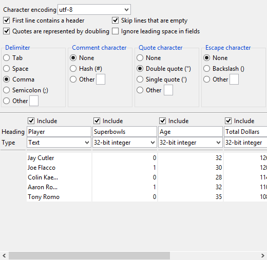
dialectpicker widgetThe top section of the widget contains the various settings related to parsing of CSV data. The middle section shows column metadata specifying whether the column should be included in the created table, the heading for the column and it type. The bottom section displays a preview table which is updated as these settings are modified by the user.
The CSV settings and column metadata are initialized based on heuristics applied to the CSV data and can then be modified by the user.
WIDGET read method
The widget’s read method parses the CSV data into a table using
the current settings in the dialog. The return value from the method
is a list of two elements. The first is a table containing the data.
The second is a dictionary keyed by column name and is in a form
that can be passed to the tableview widget via
the -colattrs option to configure its headings. The value associated
with each column name is a dictionary with one key heading whose
value is the corresponding column heading from the widget.
The names of the column in the returned table are generated from
the corresponding column headings entered into the widget with
non-alphanumeric columns replaced by the _ character. If any
columns headings are empty, a name is generated for it.
|
|
The widget does not validate that the actual data in the CSV file
is the specific type selected for a column by the user. In case of
a type mismatch, the read method will fail with a suitable error
and the user can be asked to modify the widget settings.
|
The following code uses the widget::dialog dialog widget from
the tklib package
to read CSV data into a table.
package require widget::dialog
widget::dialog .dlg -type okcancel
tarray::ui::csvreader .dlg.csv qb.csv
.dlg setwidget .dlg.csv
set response [.dlg display]
if {$response eq "ok"} {
    .dlg withdraw
    lassign [.dlg.csv read] tab colattrs
    tarray::ui::tableview .dlg.tab $tab -colattrs $colattrs
    .dlg configure -type ok
    .dlg setwidget .dlg.tab
    .dlg display
}
destroy .dlg
.dlg display
}
destroy .dlg| User response will "ok" or "cancel" | |
| Hide the dialog | |
| Read the CSV data into the table | |
| Create a tableview display | |
| Show the table in the dialog |
3.2.2. rbcchart WIDGET TABLE ?OPTIONS?
The rbcchart widget is a wrapper around the barchart
and graph widgets from the RBC package that simplifies the
plotting of data in tables.
|
|
At the time of writing (May 2018), the original RBC package suffers from some crashes on 64-bit Windows. It is recommended that you use this fork which fixes these crashes. It also exposes C interfaces that greatly speed up plotting of tables. |
This document describes the basic operations of the widget and specifics related to display of table data. For details about the myriad options related to the RBC widget itself, refer to the RBC documentation.
The RBC barchart and graph widgets are very similar to each
other in that they both plot two-dimensional (X,Y) data with the
only difference being the barchart widget displays the data as
bar chart (no surprise!) whereas the graph widget draws line
plots. Both support display of multiple plots and the same set of
options and features like colors, legends, zooming and
so forth. In fact, either widget can display the other type of
plot and the tarray_ui::rbcchart makes use of this to provide
a common wrapper that can plot bar charts and graphs within the
same widget.
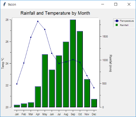
The widget is created by passing it the table whose column(s) are to be plotted in the widget. The example below creates a widget used for plotting temperature and rainfall over a year.
set rain [tarray::samples::get rainfall]
tarray::ui::rbcchart .chart $rain -title "Rainfall and Temperature by Month"
→ .chart
With the exception of the option -xcolumn, all options,
including the -title option used above, are
passed through to the RBC chart widgets and are not described here.
Refer to the RBC documentation for details.
The -xcolumn option specifies the default table column name
to be used for the X-axis if one is not specified in the widget’s
line and barchart commands that are used for plotting.
If this option is not specified, the first column of the table
will be used as the default. In our example above, the first
column is Month and will be used for the X-axis.
Once the widget is created, plots may be added to it using either
the line widget method for plotting line plots or bar for bar
charts.
WIDGET line create PLOTNAME ?OPTIONS?
WIDGET bar create PLOTNAME ?OPTIONS?
The command below creates a line plot named Temperature.
.chart line create Temperature -pixels .02i
→ Temperature
All options, like -pixels above, are passed through to RBC with
the exception of the options -xcolumn and -ycolumn.
The -xcolumn option specifies the column whose data is to be used
as the X-values for the plot. If unspecified, the -xcolumn
option specified at widget creation time, or the first column if
that was not specified either, is used.
The -ycolumn option specifies the column to be used for the
Y-values of the plot. If unspecified, the Y-values are taken from
the column with the same name as the plot name, Temperature in
the example above.
Note that the columns need not be sorted beforehand. The widget will sort in order of X-values appropriately.
One point to be noted is the widget keeps the full functionality
of the underlying RBC widget. In particular, you can use the RBC
-xdata and -ydata options instead of -xcolumn and
-ycolumn. In that case, the corresponding values for the created
plot are taken from the option values and not from the table. Thus
data from the table and data stored elsewhere can be displayed on
the same plot.
To define a Y-axis for the data, which is desired in most cases,
the axis widget method is used.
WIDGET axis configure AXISNAME ?OPTIONS?Again, only an example is shown below, with details being punted to the RBC documentation.
.chart axis configure Temperature -loose 1 -title "Temp (\u00b0C)"The bar method works in identical fashion as illustrated
below with the difference being the choice of color and axis
location.
.chart bar create Rainfall -fg green -yaxisloc y2axis
.chart axis configure Rainfall -title "Rainfall (mm)"
pack .chart
The created chart is shown below.

In summary, the rbcchart widget exposes the full functionality
of the RBC widgets which do all the heavy lifting. The value it
adds is simplification of chart construction by automating loading
of data stored in tables, defaulting of axis configuration,
sorting of data and some conveniences like non-numeric axis (like
the Month X-axis above) that you would otherwise have to program
yourself.
3.2.3. tableview WIDGET TABLE ?OPTIONS?
Creates a tableview widget that displays data from a
table. It is written with a view to conserve
memory when displaying tables with a large amount of data. At
the same time it provides several standard features without requiring
any additional programming on part of the developer.
The widget is based on Tim Baker’s treectrl widget which is
available from SourceForge and must
be downloaded separately.
WIDGET should be the Tk window path for the widget. This is also the return value of the command. TABLE should be a tarray table containing the data to be displayed. The supported options for the command are shown in Tableview options.
| Option | Description |
|---|---|
|
Specifies various attributes for each column, such as title label. See Column attributes. |
|
Specifies a command prefix to be invoked to format data for display. See Formatting data and visuals. |
|
If specified as |
|
Allows definition of states that control the visual aspects of displayed data such as fonts and colors. See Formatting data and visuals. |
|
Controls rate of horizontal scrolling when the dragging the horizontal scrollbar slider with the mouse button pressed. DELAYSPEC is a list of one or two integers in milliseconds. The first is the delay after the initial scroll and the second, which defaults to the same value as the first, is the delay for subsequent scrolls. |
|
Similar to the |
Column attributes
Each display column in a tableview has attributes that are specified
with the -colattrs option when the widget is created. The value passed
with this option should be a dictionary keyed by the column name in the
table. The corresponding value in the dictionary is itself a dictionary
keyed by the attribute name. Defaults are used for missing column
and attribute keys.
Column attributes are shown in Tableview column attributes.
An example is shown below.
toplevel .cities
tarray::ui::tableview .cities.tbl $cities -colattrs {
    geonameid {Heading Id Justify left}
    name      {Heading City}
    country   {Heading {Country Code}}
    latitude  {Heading Latitude}
    longitude {Heading Longitude}
    population {Heading Population}
    elevation {Heading {Elevation (m)}}
}
pack .cities.tbl -fill both -expand 1
Note that not every attribute has to be defined for every column and not every column needs to be listed (though we have listed all above).
Formatting data and visuals
By default, the widget displays table data in its “natural” string representation. In some cases the application may need to format it differently, for example, displaying an integer in hexadecimal form. Moreover, some values may need to be visually distinguished, negative values displayed in red for instance.
Both these needs are met through the use of the -formatter and
-visuals options to the tableview widget.
A visual defines a named visual state as a combination of font, foreground and background colors. These states can be applied to table rows or cells to visually distinguish them.
There are 7 such states, visual1..visual7,
and the settings for each can be defined through the -visuals option.
The value supplied for this option should be a dictionary keyed by
the name of the visual state. The value associated with each defined
state is itself a dictionary with the (optional) visual attribute
keys shown in Tableview visual attributes.
The order in which visual states are passed in the -visuals option
is important. When multiple visual states are applied to a row
or cell, the visual states that appear earlier take priority over
those that appear later in the case where both states include the
same attribute.
Once the visual states have been defined, they can be applied to any row or individual cell through the formatter callback. This is described next.
If the default string representation of data or its visual display
is not suitable, an application can provide a callback via the
-formatter configuration option that will be used to convert
the data into a suitable form for display.
The value passed for this option
should be a command prefix which will be invoked with
two additional arguments. The first is the index of the row being
formatted in the table that was passed to the widget. The second
is a dictionary keyed by column names and containing the corresponding
table cell values.
The return value from the invocation should be a list of one or two elements. The first element should be in the same form as the second argument passed to the callback, i.e. a dictionary indexed by column names. The dictionary values will be used as the display strings for the corresponding columns.
The second element is optional and if present, specifies the visual states to be assigned to the row or individual cell. This should be a dictionary keyed by the column name. The corresponding value should be a list of visual states to assign to the cell in that column and row. If more than one state is specified, defined attributes in states appearing later in the list override those attributed for states earlier in the list. The dictionary may also contain the empty string as a special key whose value is again a list of visual states. This will apply to all columns in the entire row.
|
|
The visual states associated with a cell is the union of the states
associated with the row containing the cell and the states directly
applied to the cell. When two states define the same attribute, the
one that takes effect depends on the order in which the visual states
were listed in the -visuals option as discussed earlier.
|
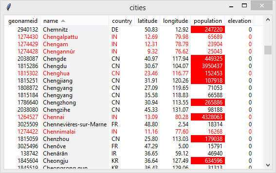
The small sample script below demonstrates the use of -visuals and
-formatter. The format_city callback formats the latitude and
longitude values to two decimal places. Additionally, it highlights
all tropical cities in red, and population values above a hundred
thousand are shown with white text on a red background.
proc format_city {row_index row_values} {
    foreach col {latitude longitude} {
        dict set row_values $col [format %2.2f [dict get $row_values $col]]
    }
    set visuals {}
    set latitude [dict get $row_values latitude]
    if {$latitude < 23.5 && $latitude > -23.5} {
        dict set visuals "" visual2
    } else {
        dict set visuals "" ""
    }
    if {[dict get $row_values population] > 100000} {
        dict set visuals population visual1
    } else {
        dict set visuals population ""
    }
    return [list $row_values $visuals]
}

toplevel .cities
tarray::ui::tableview .cities.tbl $cities -formatter format_city -visuals {
    visual1 {-bg red -fg white}
    visual2 {-fg red}
}
pack .cities.tbl -fill both -expand 1
| Set the visual for the entire row | |
| Set the visual only for the population cell | |
Note visual1 which is applied to a column cell is listed before visual2 so as to give it higher priority |
A view generated from the above script is shown below.

Filters
Filters are a mechanism that let the end-user restrict displayed data
to table rows that match certain criteria. Filters are enabled
by configuring the widget’s -showfilter option as true.
Enabling filters results in an additional header row being displayed under the heading for each column. Clicking in the filter header for a column will display an entry field where the user can type in an filter expression. Only those rows for which the cell for that column matches the expression will be displayed. When filters are defined for multiple columns, all have to match for a row to be displayed.
The filter syntax is
CONDITION VALUEwhere CONDITION is one of the conditions shown in Filter conditions and VALUE is the value to be compared against the column cell.
If an operator is not specified, it defaults to == (equality).
The standard entry editing keys are available when editing a filter entry. Additionally,
-
Tab or Enter will save the filter,
-
Escape will revert the filter entry to its original value, and
-
F1 will show a help dialog summarizing filter syntax.
Clearing filters
The widget’s clearfilters method clears all currently set filters.
WIDGET clearfiltersAn application can invoke this from a menu or toolbar control to reset all configured filters. This is more convenient for the user than having to manually clear all configured filters.
The following call displays
the contents of a variable cities containing a
table of geographical data.
tarray::ui::tableview .cities $cities -showfilter 1
pack .cities -fill both -expand
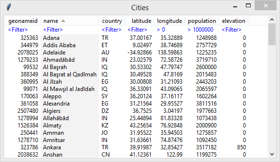
The corresponding table, sorted by name and filtered to only list cities in the eastern hemisphere having a population of more than a million, is shown below.

Sorting
Clicking on a column header sorts the table based on the values in that column.
Selection and clipboard
The tableview widget implements bindings for selecting rows that
follow the behaviour of the Tk listbox widget’s extended select mode.
See the documentation for listbox for details.
The widget generates a <<ListboxSelect>> event when there is any
change in the selection. The %d placeholder in any bound script
is replaced with a list of two elements. The first is a list of
row indices removed from the selection and the second
a list of row indices added to the selection.
Scrollbars
The tableview widget has built-in horizontal and vertical
scrollbars that appear as needed. There is no need for
applications to provide separate scrollbars.
Keyboard bindings
The tableview widget has the following keyboard bindings by default.
-
<<Copy>>copies the currently selected rows to the clipboard. The rows are copied as text with tabs separating cells and newlines separating the rows. Usually bound to Ctrl+C. -
<<SelectAll>>selects all rows in the table. Usually bound to Ctrl+a or Ctrl+/. -
Escape clears the selection.
-
Up and Down move the selection by one row. If the Shift key is pressed, the selection is extended instead.
-
The Next/PgDn and Prior/PgUp move the display by a page. The selection is not affected.
-
The Ctrl+Next/Ctrl+PgDn and Ctrl+Prior/Ctrl+PgUp right or left by the width of the window.
-
Home and End keys scroll the table horizontally to the first and last columns respectively.
-
Ctrl+Home and Ctrl+End move the display to the top and bottom of the table respectively, setting the selection in the process. If the Shift key is simultaneously pressed, the selection is extended.
Mouse bindings
The tableview widget has the following mouse bindings by default.
-
<Button-1>will set the selection to the row under the mouse. -
If the Ctrl key is pressed in conjunction, the row under the mouse is added to the selection if not already present, or removed if it is.
-
If the Shift key is pressed in conjunction, the selection is extended to include all rows between the selection anchor and the row under the mouse.
-
Dragging with
<Button-1>pressed extends the selection. If the mouse is moved out of the window, contents are scrolled if necessary. -
Double clicking
<Button-1>results in the window generating the<<ItemDoubleClick>>virtual event. -
Clicking
<Button-3>results in the window generating the<<ItemRightClick>>virtual event.
When the virtual events <<ItemDoubleClick>> and
<<ItemRightClick>> are generated,
the %d substitution placeholder in the script bound to these
events will be replaced with a dictionary with the keys
Row and Column containing the row index and column name
of the table cell. The dictionary may contain additional keys
which should be ignored for future compatibility.
Tooltips
Data that is too long to fit within a column cell width is shown truncated with ellipsis. Hovering over the cell will pop up a tooltip containing the full data.